Afrographique – Images for Africa
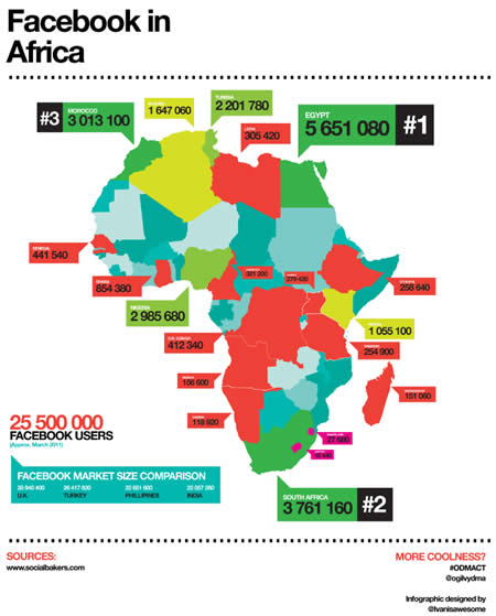
I’ve just discovered Afrographique, a site of useful, interesting, attractive and easy to understand images depicting data about Africa – There’s a map of Facebook users, a graph of African mobile subscriptions, a map of foreign investment in Africa, a look at LinkedIn users, amongst other graphics.
It’s exciting because the images are so well presented – they’re clear and accessible and simple to view. But it’s also impressive because they give you at a glance powerfully displayed information about Africa. And, assuming you think that things like investment, mobile phone penentration and social networking usage are good things, they’re images of Positive developments in Africa.
According to the website:
Afrographique is Ivan Colic’s small contribution to assist the changing perception of Africa and it’s people – hopefully you will be able to learn something as well. This blog aims to collect as much data as possible with the aim of presenting the information in an exciting and digestible format to all.
From the looks of it, Ivan regularly adds new maps and graphics to the site – so it’s worth flagging the site or subscribing to his RSS feed so you know when he’s added something new. I’m really looking forward to seeing what he depicts next.


